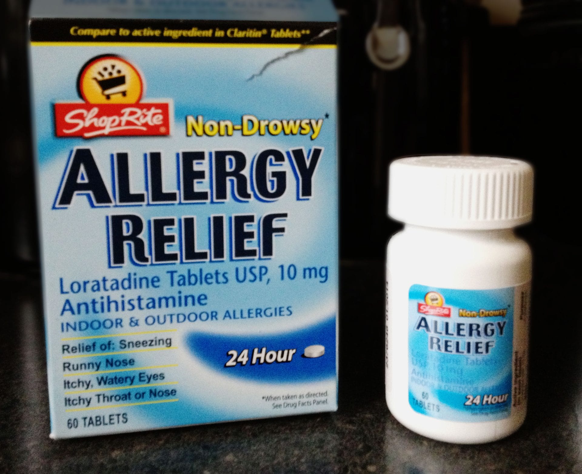
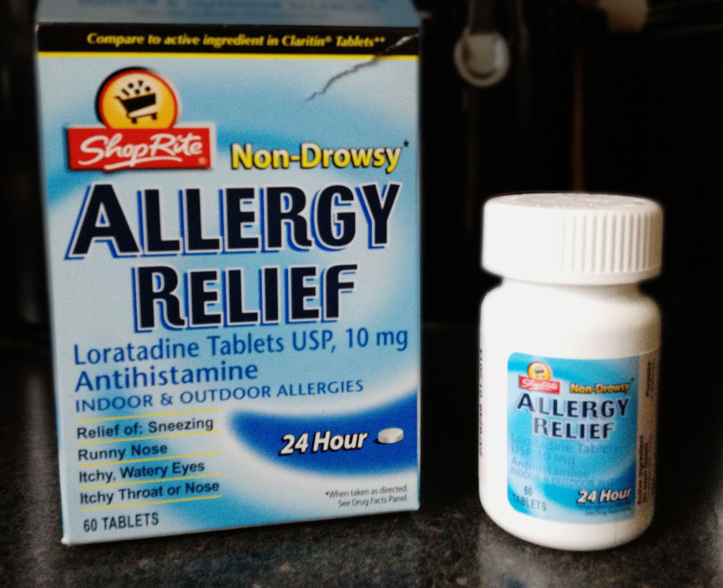
When I opened my “generic” store-brand Claritin (excuse me Loratadine) the box I thought held two bottles actually only held one. And I just chuckled and shook my head. What a waste.
I understand. I’ve been in the meetings where the client wants the packaging to be “bigger” so it’s perceived to be more expensive or impressive. But when it’s your own store brand for a product that’s fairly common-place now. It’s simply a waste of resources and frankly, bad for shelf space. Why take up more space on the shelf, cheating valuable space away from other products.
Sometimes, as designers, we simply have to call-out stupid for being stupid. The packaging is a waste of space and waster of resources and simply generates more trash. I doubt it makes a significant impact on overall sales.
So as I type this post…I’m shaking my head some more. I mean really… such a waste.


